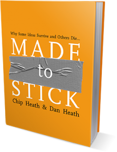
6 ideas for applying “Made to Stick” in virtual presentations
In Made to Stick, Chip and Dan Heath make a compelling case for six key qualities of sticky messages.
Since webinars, webcasts, and virtual classrooms are “rooms” where distraction is but one click away, besides using various techniques for getting and keeping attention, it’s worth working to make our ideas – the content itself – more sticky.
Using the Heath brothers’ six qualities as a jumping off point, here are six ideas for marrying them with techniques in your virtual presentation.
Simple: Create “tweetable moments”
In more traditional media, we’d call these “soundbites,” but the Heath brothers make the point that we don’t want these to sound silly, either.
Take action
- Find the core intent of the idea.
- Wordsmith it so it’d fit in about 120 characters or less…even if you’re not a Twitter user.
Unexpected: Use a slide as a punchline
Imagine you’re presenting and what you say goes something like this: “…so as we approach the question of how to launch widgets, the single biggest challenge you are going to face is <silence!>”
At that very moment you quit talking and change to a slide that finishes your sentence. The audience has to look. As the Heath brothers put it, surprise gets our attention (and interest keeps it, so you’ve got to say something useful).
Take action
- Make sure the idea on the punchline slide is clearly understandable.
- Shut your mouth. Keep it shut. What will feel like forever to you won’t to your audience.
Concrete: Repeat your main points…visually
Any live presentation means there is no “rewind” button. Since virtual presentations increase the importance of your slides, it’s not only worth letting your main points hog the spotlight, but showing them visually more than once can powerfully reinforce the sticky factor.
Take action
- For key points, put less on the slide. Make sure the signal in the “signal-to-noise” ratio is significant.
- Consider multiple summary slides (such as one at the end of each section).
Credible: Add “sources cited” to your handout
Citing your sources doesn’t mean you’re not an original thinker. External validation improves your authority. Many or most sources you cite in a presentation, however, aren’t accessible (what are they going to do, copy down an 110-character URL displayed at the bottom of your slide?).
By the way, this tactic will make your presentation handout stickier, too.
Take action
- Repeat after me: Great slides make lousy handouts, and great handouts make lousy slides.
- Create a separate handout that includes your bibliography or sources.
- Bonus: Make sure the .pdf has hot links.
Emotional: Invest in the right image(s)
Logic and belief are important, but they’re not enough. Sticky isn’t about pushing people’s buttons…it’s about making them care and feel inspired to act.
Quoting the Heath brothers again, “‘Show, don’t tell’ doesn’t mean that you take your slide about ‘thinking globally’ and add a clip-art world map. That’s decoration, not communication.”
Take action
- Be prepared to spend money. Killer, memorable images are rarely free, and if they are…
- Be prepared to spend time. Finding just the right image is hard; finding one that’s free is harder.
Stories: Use a multiple slide sequence
Credibility helps people believe and emotions make people care. Stories and examples are the building blocks that bring together concrete examples into the form of compelling argument.
Showing the story as you say it gives you a chance to multiply the impact of your message.
Take action
- Use a sequence of pictures that unfold the message visually.
- Divorce yourself from the idea that a slide equals a duration of time.
- Choose images that are consistent visually (e.g., don’t mix clip art and photographs).

Craig Hadden – Remote Possibilities
Great advice Roger!
I particularly like your point about citing credible sources, and making the handout’s links clickable. Those links should be “deep” – that is, taking people to the specific piece of content you want to point out, rather than (say) dumping people at the start of 60-minute YouTube clip or at page 1 of a 40-page written report.
Here’s how you can make a link to a specific minute (or second!) in a YouTube clip:
http://remotepossibilities.wordpress.com/2012/06/01/analog-presentation-tips-1-use-a-flipchart/#youtube_tip
And near the bottom of that tip, you’ll also find posts about linking to a certain page of a PDF, or a certain slide in a SlideShare or Brainshark presentation.
I hope you find those useful. Cheers!
TheVP
Sweet! Great tip. Thanks Craig!
Made to Stick: Additional resources to arm yourself | INFORMAZE
[…] useful resource is an article by Roger Courville – this is more of a conventional blog article, but it has some really good points to check […]