9 ideas for when you HAVE to put all that text on a slide
I love visual, minimal-text, context-building, storytelling slides as much as anybody on the planet. In reality, sometimes you just have to put a pile of text on the PowerPoint slide (e.g., to teach a legal definition, to review wording of marketing copy, or…).
Here are some ideas for what to do when you have to put text on a slide:
Before your webinar
Ask, “Where do the eyes go?”
When someone first glances at the slide, where do you want them to look first? Hint: White space (or “negative space“) is your friend.
Pay attention to font size
Hopefully you do this for an in-person room, too (so people in the back row can see it). Online you may have mobile attendees with smaller screens. And it’s likely your online attendees can’t zoom or change resolution on the fly.
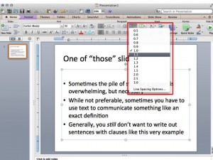
Increasing the space between lines will help a pile of text look less crammed.
Be careful with highlights
If everything is accented (e.g., bold, red, italicized et al), then accents become meaningless (if not confusing).
Consider a participant guide
Does all that stuff have to go on a slide? Blending the experience by using a companion document may be the better choice.
During your webinar
Ask explicitly for attention
This is good practice in a short-attention span environment anyway, and we never have 100% attention in any context. When the exactitude of your text requires people to pay attention, don’t assume or leave it to chance.
Read, and then quit reading
Audiences loathe presenters who read slides, but this is a unique case. When you’ve included that passage of text because you need the exact wording, skilled reading can improve comprehension. Just don’t do it for the whole presentation.
Direct attention visually with a pointer or annotation tool
The good: Like the bouncing ball on a karaoke screen, directing attention helps the audience. The bad: Overdoing it. The ugly: Ending up with a scribbled mess because you don’t use your tools effectively.
Use a sequence of highlights
This tactic is like the karaoke bouncing ball in that it emphasizes passages of text progressively. Imagine you had a short paragraph of legal text. You start by duplicating the slide. Then on the first slide, you highlight the first sentence or passage, on the second you return that passage to normal formatting and highlight the next sentence or passage. Then as you step through the text, you advance your slides, creating a sequence of highlights to guide the reader.


John Fox
Hurrah for left-align headings! It’s the first thing I fix for my clients who use the default PPT center-align heading/title.